🟠 Bitcoin Tokenomics Explained
Understanding Scarcity, Supply, and the Price Illusion
📦 What Is Bitcoin’s Supply?
Bitcoin’s tokenomics are centered around one powerful idea: fixed supply = digital scarcity.
When Bitcoin launched in 2009, it introduced a supply model unlike anything the financial world had seen:
Maximum Supply: 21 million BTC
Circulating Supply (as of 2025): ~19.7 million BTC
Remaining Supply: ~1.3 million BTC (to be mined over ~115 years)
This predictable, capped issuance is hardcoded into Bitcoin’s protocol, making it the original deflationary digital asset.
💰 The Per-Coin Price Illusion
When people see 1 BTC = $120,000+, the natural reaction is:
“Bitcoin must have the most money invested into it!”
But this is where most people get it wrong.
The price per coin tells you nothing about how much capital is actually invested.
It only tells you what people are willing to pay for the next smallest unit of BTC.
In reality, Bitcoin’s high price is a product of:
Low total supply
Gradual sell-off over time
Arbitrage-driven market alignment
And most importantly: scarcity-based price pressure
📈 What Actually Matters: Circulating Supply × Price = Market Cap
Bitcoin’s market cap (Price × Circulating Supply) is around $2.3 trillion.
But even this number can be misleading. It assumes all 19.8 million BTC are liquid and available, when in reality:
Millions are lost or dormant
Many are held long-term or locked in institutional custody
A small % of BTC actually drives price movement
So what truly drives price?
➡️ How many coins are sold and how much USD was required to buy them.
This is where Hypermatics comes in — flipping the focus from market cap to actual invested value, price impact, and percentage of supply removed from circulation.
💸 Hypermatics View: The Real Capital Behind Bitcoin’s Price
Traditional metrics like market cap offer a surface-level snapshot. Hypermatics digs deeper, asking:
How many BTC have actually been bought and sold?
How much USD was required to push the price this high?
What’s the true demand curve behind this price level?
Instead of relying on supply × price, we calculate:
🧮 Invested USD = (Current Price – Launch Price) × Estimated Coins Sold
For Bitcoin:
Launch Price: ~$0.003
Current Price: ~$120,357.72
Circulating Supply: ~19.89 million BTC
Estimated % of Coins Sold: ~98–99%
Coins Likely Sold Into the Market: ~19 to 19.6 million
➡️ That means it took hundreds of millions in capital to reach this price — not just because of scarcity, but because of real, compounding buy pressure across 15 years.
📊 The Hypermatics Advantage
Here’s where Hypermatics goes further:
| Metric | Traditional View | Hypermatics View |
|---|---|---|
| Market Cap | Supply × Price | Often misleading |
| Price Movement | Speculation-driven | Based on % of supply removed |
| Capital Invested | Not measured | 🔒 Premium Metric |
| % of Pool Sold | Not visible | 🔒 Estimated ~98–99% for BTC |
| Impact Rating | Not available | 🔒 90%+ — Exponential Zone |
| Price Curve Shape | Linear in most models | Hyperbolic — grows rapidly near 100% |
📈 The Hyperbolic Price Curve
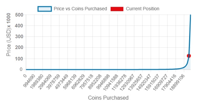
As more BTC are removed from circulation (sold and held), the available supply shrinks — but price doesn’t rise evenly. It follows a hyperbolic curve:
Early on: $100 buys a significant % of the pool
Near the top: $10 million barely moves the needle
Result: Price accelerates exponentially as scarcity deepens
A red dot on the curve shows Bitcoin’s current position:
Near the top of the curve — where small shifts in demand can create massive price volatility.
🧠 This is why Bitcoin’s price is so high — not because it’s “the best,” but because it’s one of the most scarce and most aggressively acquired assets in history.
📈 Understanding the Curve
The chart above illustrates how Bitcoin’s price accelerates as more coins are purchased and removed from circulation.
In the early stages, price increases gradually — but as supply dries up, even small purchases cause sharp price jumps.
🔴 The red dot marks Bitcoin’s current position: high on the vertical part of the curve. This places the asset in a high-saturation, high-volatility zone, where price reacts rapidly to demand, climbing along a near-vertical path.
💬 Hypermatics Deep Dive:
While traditional metrics stop at market cap, Hypermatics goes deeper.
By analyzing capital invested, saturation level, and price resistance zones, we uncover the real drivers behind BTC’s price.
🔢 Bitcoin Metrics Table:
| Metric | Value | Access |
|---|---|---|
| Launch Price | $0.003 | ✅ Public |
| Current Price | $120,357.72 | ✅ Public |
| Circulating Supply | 19,893,796 BTC | ✅ Public |
| Estimated % Coins Sold | 🔒 ~94% | 🔐 Pro Only |
| USD Invested (Hypermatics) | 🔒 ~$2.39 Trillion | 🔐 Pro Only |
| Impact Rating | 🔒 90%+ | 🔐 Pro Only |
| Price Slippage (10B buy) | 🔒 High | 🔐 Pro Only |
Unlock the full Bitcoin analysis and access exclusive metrics across all major tokens.
Upgrade to Pro Version for Full Access View Pricing.
🔄 The Token Lifecycle Explained
Most crypto investors think price reflects hype or market cap — but Hypermatics reveals the truth:
Price is driven by how many coins have been sold.
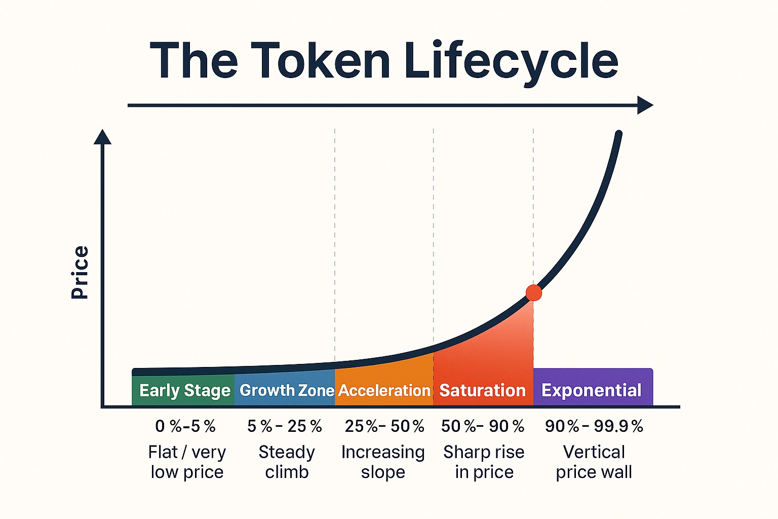
As coins are purchased and removed from circulation, price climbs a hyperbolic curve through predictable stages.
| Stage | Description |
|---|---|
| 🟢 Early | Coins are cheap, pool is full, price changes slowly. |
| 🔵 Growth | Moderate buying causes price to climb steadily. |
| 🟠 Acceleration | Bigger capital needed for smaller gains — price begins to curve up. |
| 🔴 Saturation | Supply thins out — each purchase has large impact. |
| 🟣 Exponential | Very few coins remain — price shoots up with extreme volatility. |
🧠 Want to know where your favorite coin is on the curve?
🔐 Unlock full lifecycle simulations for top tokens with Hypermatics Pro.
View Pricing
Explore Charts